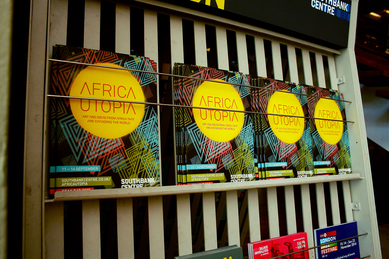
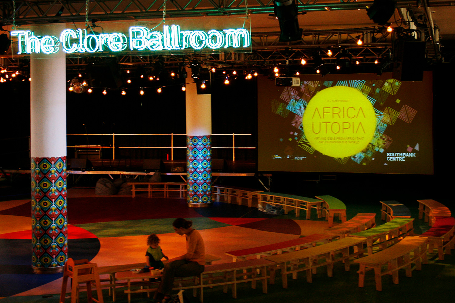
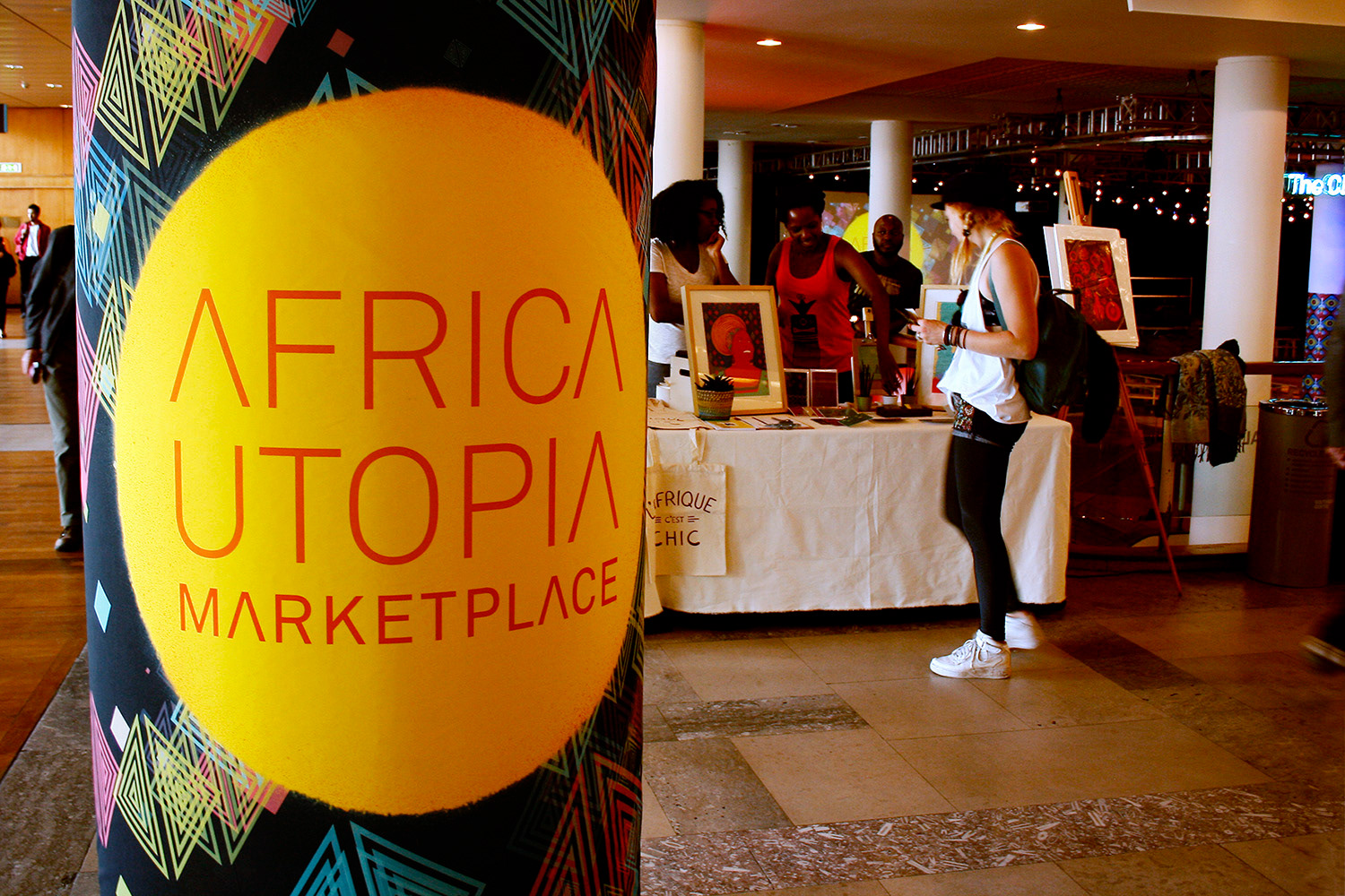
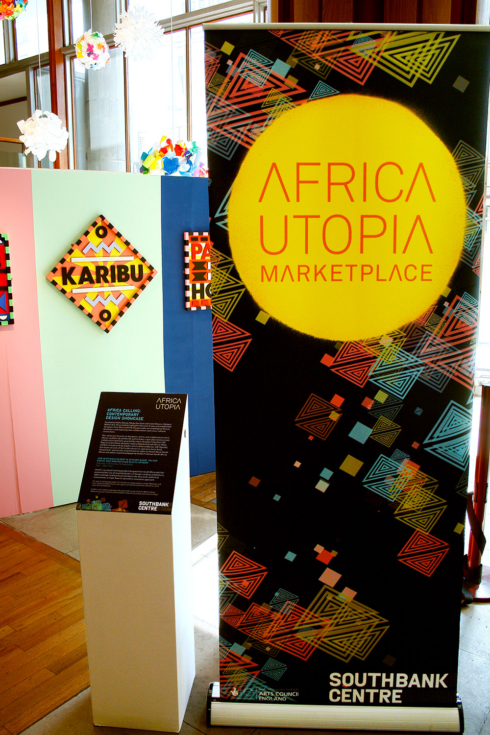
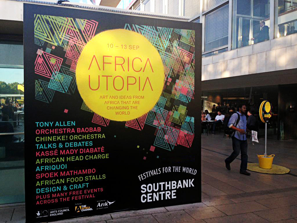
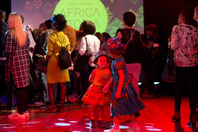
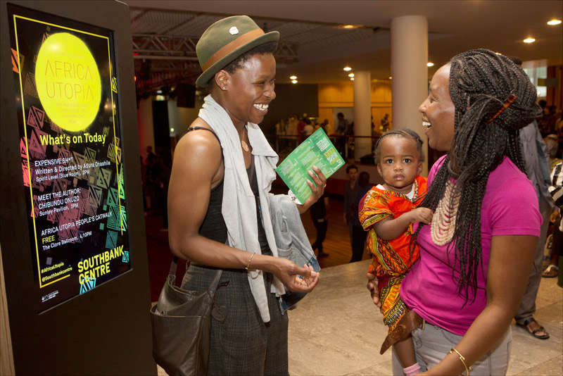
Africa Utopia 2014
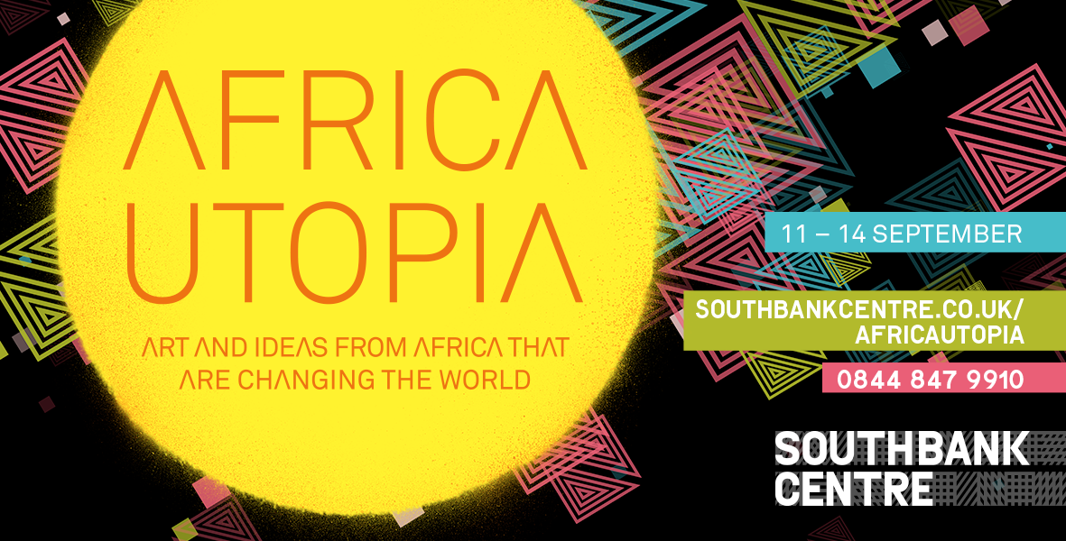
The brief requested a "dynamic and forward-thinking" identity to reflect the festival’s themes of technology and entrepreneurship. Its previous identity was heavily influenced by African fabrics which the promoters felt was too rural and craft-like for their new focus on modernity. However, as the festival was in the growth stage they were worried about having an inconsistent message. My solution was to take elements from an African textile design and animate them with code. This provided a backdrop for digital formats and an endless supply of images for print, allowing every format to have a different background.

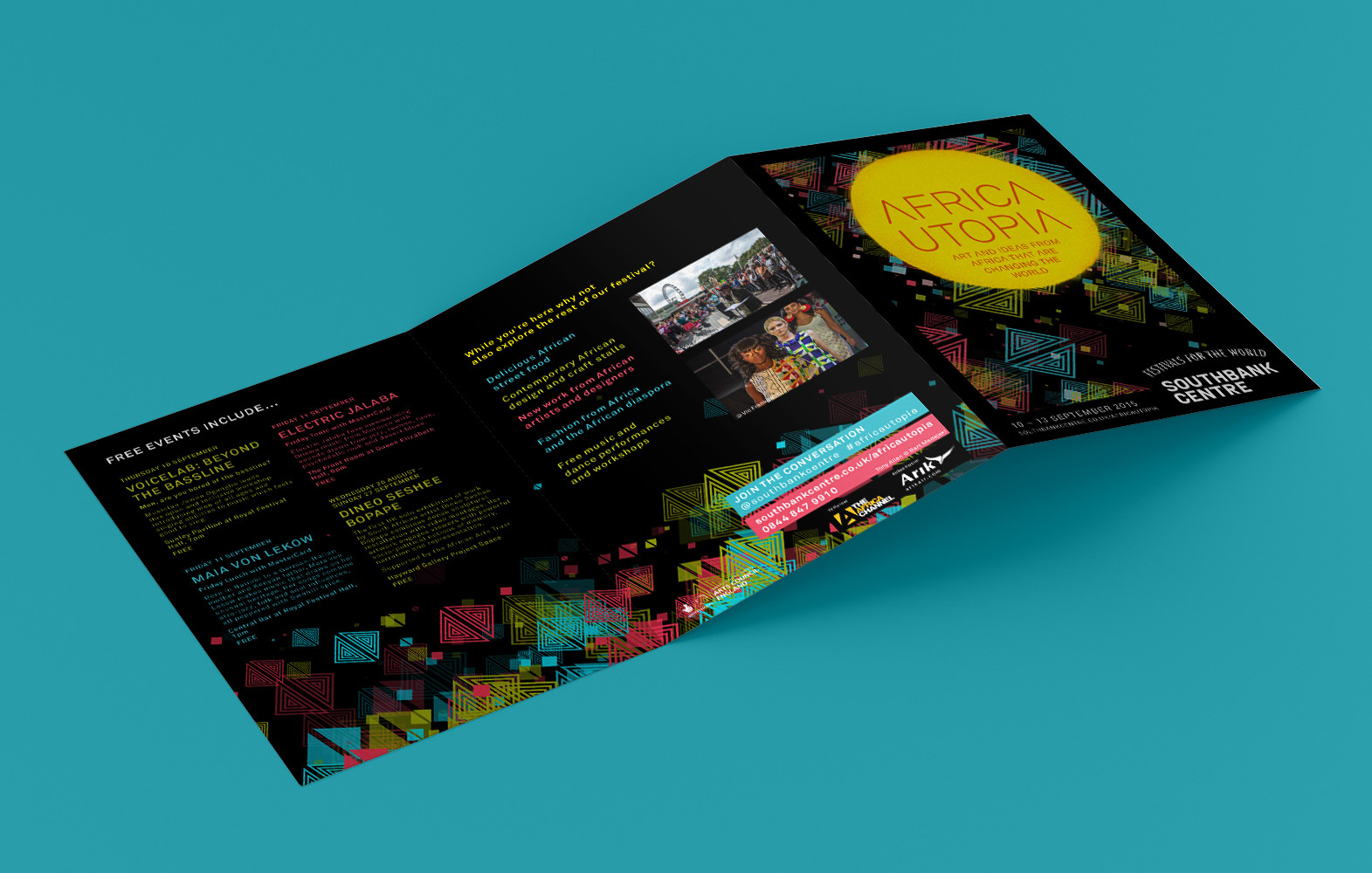
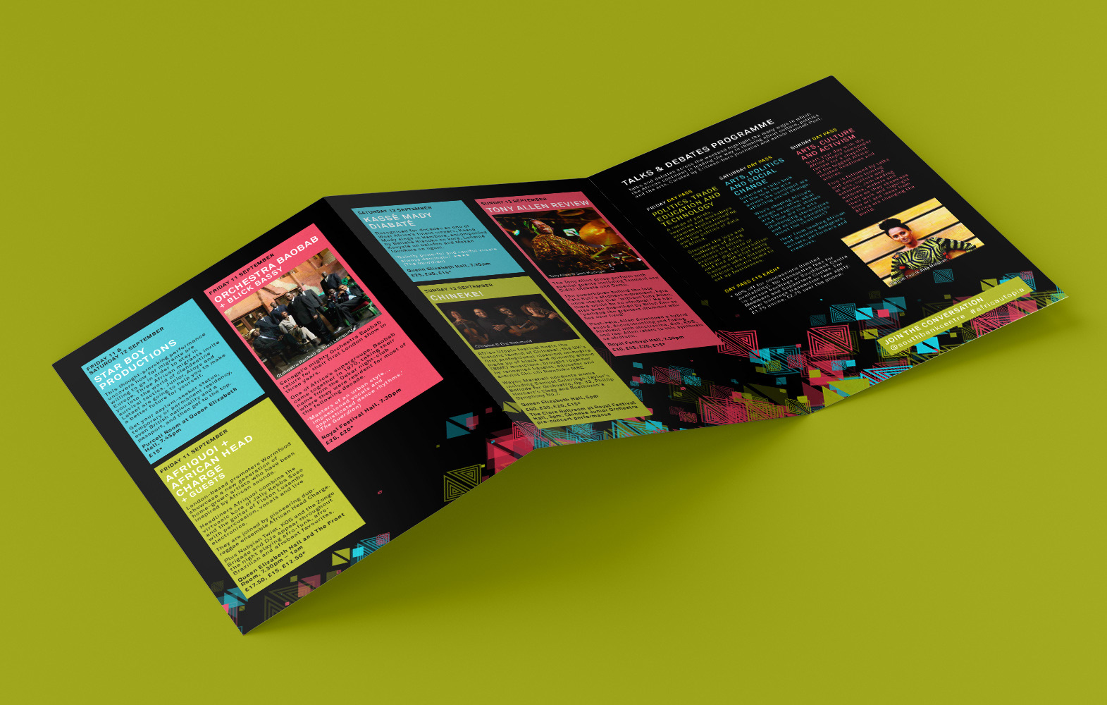
Africa Utopia 2015
We kept the same look for the 2015 identity, although slightly adapted to accomodate tweaks to Southbank Centre's branding (new logo and frame).


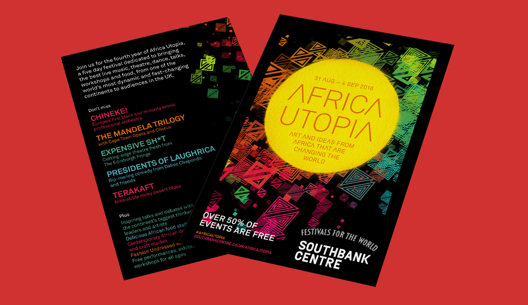
Africa Utopia 2016
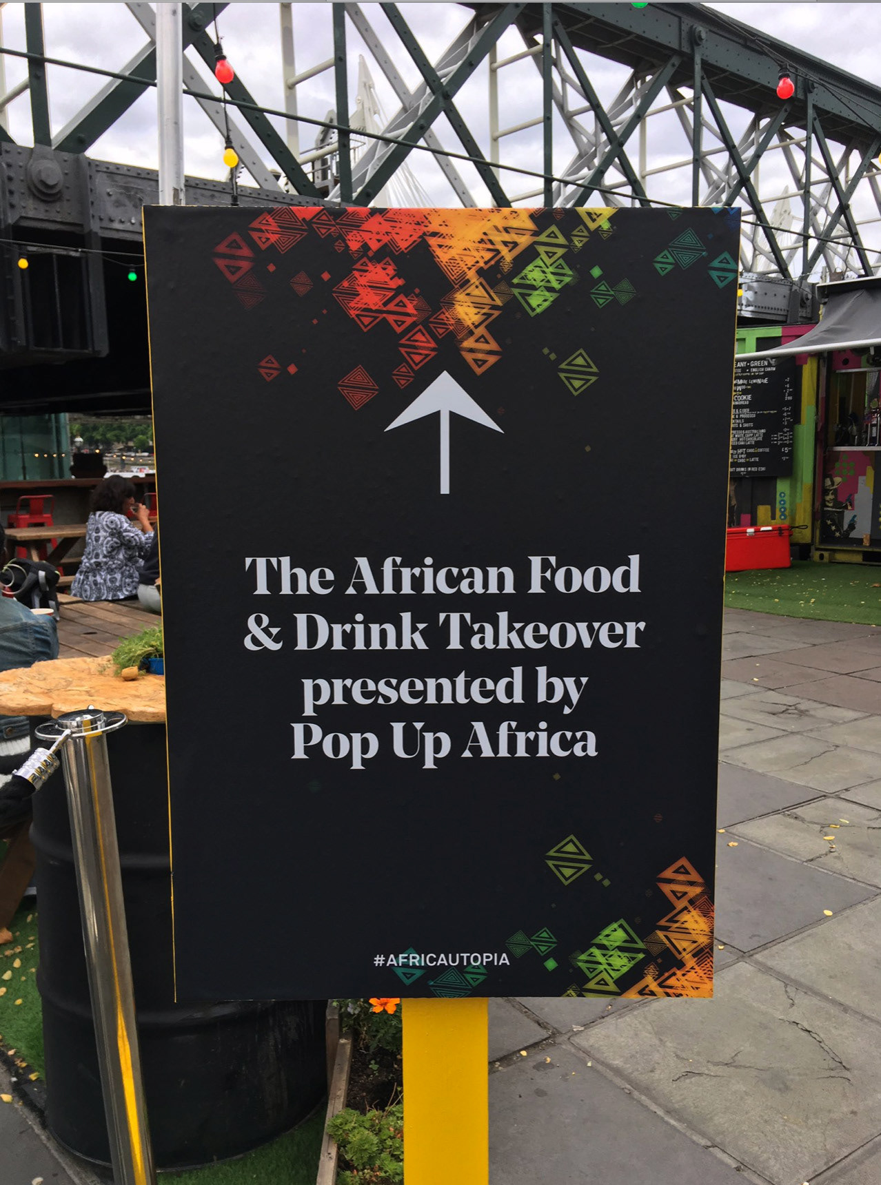
In 2016 I refreshed the illustration, updating the colours and making the animation more calm.
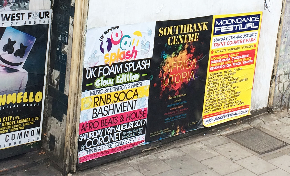
Africa Utopia 2017
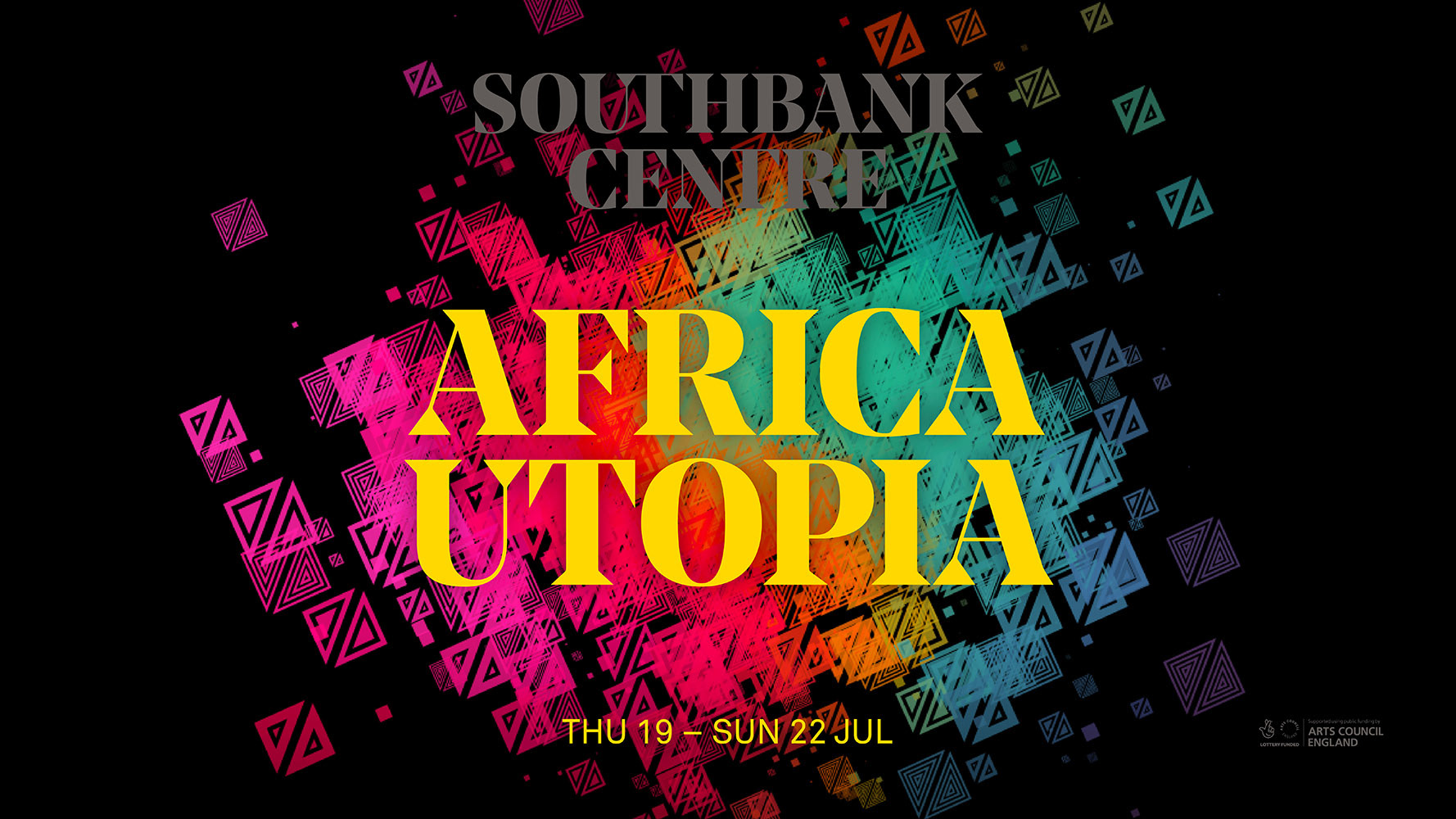
Southbank Centre's rebrand in 2017 moved the logo up top to become a masthead. Africa Utopia's 'sun' no longer worked under this branding but consistency was important for the festival as it had built up brand recognition. I instead clustered the illustration behind the retained title treatment to serve the same framing purpose as the 'sun'.


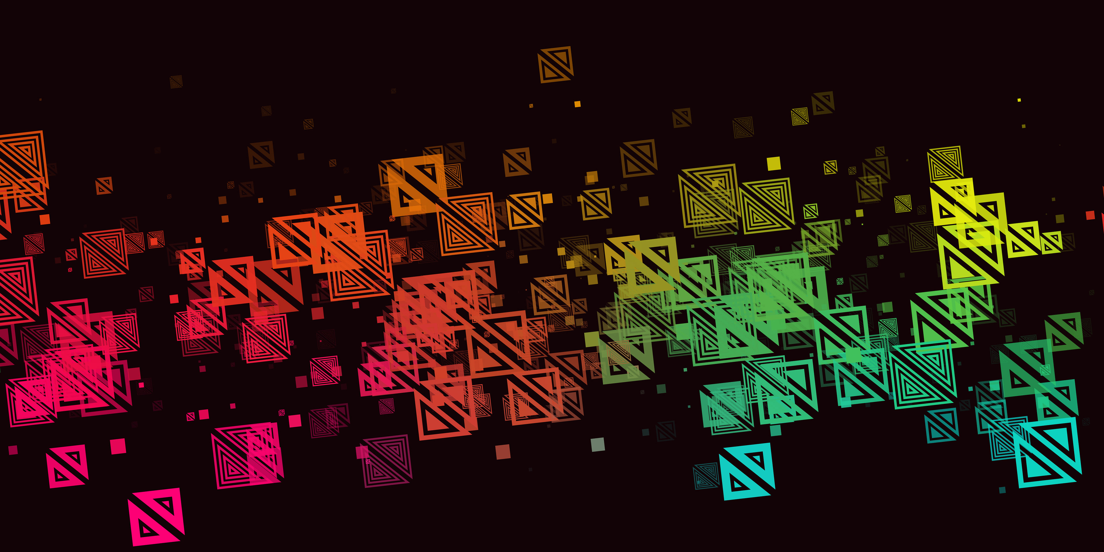
Africa Utopia 2018
The site's rebrand took place in the middle of the previous Africa Utopia campaign. By 2018 it was decided that all event titles should be in Southbank Centre's Noe font. I refreshed the colours once more and made the masthead more recessive.